|
|
| |||||||||||||||||||||||||||||||||||||||||||||||||||||||||||||||||||||||||||||||
![Light lab, Exploratorium, San Francisco, California. Click to see 800x600. [C-2000Z]](http://dpfwiw.com/images/rgb.jpg)
The Brain-Eye Partnership
Vision springs from the eye and brain working in unison to form and maintain a working and workable representation or model of the external world. However faithful, the representation is all we ever "see". When Immanuel Kant first espoused it in the late 1700s, this view of perception was considered philosophy, and rather shocking philosophy at that, but neuroscience and psychology have since put it on a firm empirical footing. (Not all of Kant's ideas have fared so well, but that's another story.)
The brain reconstructs its working representation from a surprisingly limited number of physical attributes of the external world reported to it rather piecemeal by the sensory organs, the eye being a major contributor. The eye heavily processes the visual signal to make its report but leaves the brain much to do before "seeing" ensues. At the same time, the brain controls the work of the eye on both voluntary and involuntary levels.
To underscore this remarkable partnership, you'll find the phrase "brain-eye system" peppered throughout this site.
Acknowledgement: Much of the information in this and the next 2 major section comes from the University of Utah's authoritative Webvision site.
The Role of the Eye
It's no mere cliché: The human eye truly is a marvel of adaptive optics. The eye's resolution and dynamic range lie far beyond the reach of any digital camera design. Under average conditions, it can accurately record detail with light intensities ranging over a factor of ~30,000 or 15 stops in any one scene, but the absolute dynamic range—from fully dark-adapted to fully light-adapted conditions—approaches a factor of 109, or ~30 stops. By way of comparison, good color slide film barely captures an intensity factor of 32, or 5 stops, while some B&W films and digital cameras approach 8 stops. With this kind of competition, it's a wonder any camera satisfies.
The eye is much more than an optical device, however. It's also an important outpost of the brain with its own complex neural networks responsible for a substantial amount of initial visual signal processing. Among the eye's more important processing tasks, at least in the photographic context, are the initial recognition and characterization of edges, the formation of the 3 basic visual sensations,
-
brightness (black-white opposition)
-
red-green opposition
- yellow-blue opposition
and the initial separation of the brightness and color channels found throughout the remainder of the visual chain.
The Role of the Brain
There would be no seeing without the brain. Indeed, sudden damage to the brain's visual cortex takes out not only sight itself but also the awareness that sight is now gone. I can't improve on this summary of the brain's overarching role in human vision:
In general, during daytime activity, the flow of information in the brain passes from the senses into primary input areas of the cortex, through secondary areas, into the limbic system at the base of the brain. In these limbic areas, it is believed that the information is finally interpreted in terms of its emotional impact and its implications for survival. From there, plans are formulated and elaborated in conjunction with the frontal ... cortex, and finally actions are implemented through the motor cortex.
Source: Regena Technology: Inspired by the architecture of the human brain.
Spatial and Interpretive Pathways
Charged with keeping its host reproducing and therefore mobile, well-fed, and out of trouble, the brain organizes eye outputs into visual experiences by working the visual scene along two largely separate pathways:
-
a spatial pathway dedicated to localizing objects and tracking their movements
-
an interpretive pathway dedicated to identifying objects and attaching significance to them
The spatial pathway directs the motor system in its physical interactions with the external world via a 3D world model constructed with inputs from all the senses. The interpretive pathway taps areas of the brain involved with emotion, memory, language and communication to arrive at what to do about what the eyes have reported and how to go about it.
Technical Note: These pathways names are mine; proper technical terms may well exist.
Object Recognition
Object recognition—the functionally correct separation of, say, individual trees and a lurking panther in a busy jungle scene—clearly lies at the heart of both these pathways. The brain carries out this fundamental but formidable computational task in real-time with an ease that leaves robotic vision researchers armed with supercomputers shaking their heads.
| As many an optical illusion
reveals, object recognition is far from
infallible, but it works amazingly well considering all that's
involved. The process starts with the assembly of borders likely to
belong
to a single
entity into a silhouette of sorts, continues through the reconstruction
of a
plausible 3D model of the object, and then concludes with
the application of an hierarchical set of ever more specific tests or
filters leading to
a final or at least a satisfying identification and
classification of
the object at hand.
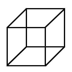
Failure to reach a convincing model or identification at higher levels can provoke retries at lower levels—hence the oscillation of the familiar Necker cube at right. |
 |
Modeling the World
The spatial and interpretive pathways interact broadly with the brain's working world model—a spottily detailed representation or, more strongly, simulation of the external world. This internal tapestry weaves together maps of where things are at varying scales, understandings (empirical and otherwise) of how they move and change, and expectations of what will happen next.
Understand that we "see" only the model, the simulation, and never the real thing.
In Chapter 11 of his book Unweaving the Rainbow, Richard Dawkins describes how the brain constructs the model, how the senses constrain it with information from the outside world, and how lingering discrepancies between the model and the modeled lead to optical illusions—and worse. To underscore the distinction between what we see and what's out there, Dawkins refers to the brain's modeling as "virtual reality in the head".
The brain's statistically-informed schemas (internal representations of external conditions or processes) are endowed with genetic wisdom, refined by accumulated individual experience and updated continuously by the senses. They aren't perfect and can't be perfect, but they're good enough to live by—most of the time.
And like it or not, the model informs even the most basic visual processes like object recognition. It also underlies the brain's ability to provide key "photographic services" like auto-focus, metering and white balance at levels of sophistication digital camera designers and users can only envy.
Apparently, the brain's modeling machinery and the interpretive pathway can both be run backward—from feelings, beliefs, meanings, goals and what-ifs to thoroughly believable visual fantasies. This is the stuff that imagination, plans and dreams are made of.
We eventually learn to discount dreams, however real they may have seemed at the time. Luckily, mental illness aside, the waking sensory stream does a decent job of keeping our "virtual reality" from slipping its moorings to the outside world while we're awake, but daydreams prove that the link can be quite elastic even then.
Expectations
Thanks to a brain prone to betting and accustomed to winning, expectations, conscious or otherwise, strongly shape what we end up seeing—perhaps unnervingly so. Optical illusions and dead-sure but false eye-witness accounts remind us that our visual bets (working models, schemas) are far from infallible, but they underlie every aspect of seeing nevertheless.
Playing on the viewer's expectations has always been an integral part of the photographer's art, but the expectations run deeper than many appreciate. They are part of the very fabric of seeing.
Functional Visual Anatomy
So much for roles—now on to the wetware itself.
The eye gathers and focuses light onto the retina, a pavement of light-sensitive cells or photoreceptors embedded in a neural network responsible for the initial organization and processing of their output. Flattened out, the retina would form a disc ~42 mm in diameter, but most of the action takes place in a submillimeter target at its optical center known as the fovea.
The table below groups the retinal photoreceptors according to role.
Human Photoreceptors and Their Roles in Vision |
|||||
| Cell Type | Retinal Location | Subtype | Role | Sensitivity | Peak (nm) |
| Cone | Central, mostly in the fovea | Long wave
|
Brightness and color detection | Red | 564 |
| Green | 533 | ||||
| Short wave | Color detection | Blue | 437 | ||
| Rod | Peripheral; none in the fovea | None | Night and peripheral vision | Blue-green | 498 |
The Fovea
Standing squarely at ground zero on the optical axis of the eye is the tiny fovea, a highly specialized submillimeter portion of the retina densely packed with cones—particularly the long wave (red and green) variety. As the designated image receiver of normal daytime vision, the fovea is home to nearly all the cones in the retina but contains no rods.
The Peripheral Retina
Rods dominate the remainder of the retina. Most of them are concentrated just outside the fovea. The largely complementary distributions of rods and cones across the retina are nicely illustrated here.
Retinal Processing
The retinal neurons interconnecting the photoreceptors are organized in a dozen layers, each composing a different sketch from the output of the rods and cones. One layer deals in edges, another in areas of brightness, another in areas of color, and so on. The ganglion cells of the retina read out the layers and report their ever-changing sketches to the brain via the optic nerve. Along the way, intermediate distribution and processing stations (the optic chiasm and the lateral geniculate ganglia, respectively) prepare the retinal output for presentation to the brain, which somehow weaves the dynamic sketches together with memories and expectations to produce the spectacularly detailed but effortless vision we so easily take for granted.
The Visual Cortex
Two symmetrical, highly specialized patches of cortex on the inner surfaces of the occipital lobes known collectively as the visual cortex serve as the primary brain sensory areas for vision. The left visual cortex services the right half of the each eye's visual field (field of view), and vice-versa.
At cortical levels, the visual signal proceeds through many layers of pattern analysis arranged (at least functionally) in ever more specific hierarchies of categorization from contrasts to edges to silhouettes to solid models to faces to Aunt Minnie and her "I'll always think of you as that little boy" smile.
Day, Night and Peripheral Vision
The large fall-off in illumination from day to night presents a great challenge to the brain-eye system. Two overlapping but largely separate retinal subsystems have evolved to handle these two regimes, which of course have everything to do with ambient light levels and nothing to do with the actual time of day.
Cones During the Day, Front and Center
Under daytime lighting conditions, vision arises primarily from the cone-dominated fovea. When we focus on an object in daytime lighting, we cast its image onto the fovea. Constant unconscious scanning by the eye effectively broadens the foveal field of view.
Rods at Night and Off-Axis
The cones are left sputtering in the low light of night, but the exquisitely sensitive rod cells dominating the retina beyond the fovea can record the arrival of a single photon. The rods are most dense just outside the fovea and fall off toward the periphery of the retina from there.
Most sensitive to blue-green light, the rods support the low-light achromatic low-resolution sensory systems we call night vision and peripheral vision. Since rods play a negligible role in photography, their contributions to vision will not be considered further.
Separate Brightness and Color Channels
It takes a fairly detailed line drawing to portray a recognizable snapdragon, but a splash of paint falling roughly within its outline suffices to establish it as a red snapdragon with few questions asked.
The well-established funneling of the visual experience into parallel high-resolution brightness and lower-resolution color channels begins in the wiring of the retina and persists through the visual cortex to the level of awareness. This partitioning of visual data opens important photographic opportunities, as we'll see below.
The Brightness Channel
The brightness channel carries spatially detailed information about incident light energy without regard to wavelength. In many ways, the brightness channel dominates the visual experience—and that may well contribute to the enduring charm of B&W images. Achromatic, luminance and lightness are alternative terms often applied to this channel.
The high-density long wave cones exclusively driving the brightness channel derive most of their stimulation from light at red through green wavelengths. Considering the heavy atmospheric scattering prevailing at blue and shorter wavelengths, suppressing short wave input seems fitting for a channel dedicated to fine spatial detail.
Built for Resolution
The structure of the fovea clearly favors brightness over color on the resolution front. The cones cover the fovea in a dense hexagonal packing, with the double-duty long wave cones outnumbering their color-only short wave counterparts 10-to-1. Moreover, the retinal units (long wave cone pairs) ultimately responsible for detecting brightness contrasts are much more finely divided than the units (clusters of long and short wave cones) needed to sort out color contrasts.
This uneven allocation of retinal resources ramifies throughout the visual experience.
The Color Channels
Two separate color channels also know as the chromatic or chrominance channels carry less spatially detailed wavelength information based on red-green and yellow-blue oppositions without regard to overall brightness. The blue-sensitive short wave cones finally get into the picture here but still end up taking a back seat to the long wave red and green cones.
Since color sensations ultimately derive from comparisons involving several long and short wave cones at once, color resolution is limited by both the combined size of all the cones aggregated and also by the low density of the short wave (blue-sensitive) cones. The segregation of red-green and yellow-blue oppositions spares the red-green channel from the latter coarsening at least.
Come to think of it, the retina's distributed arrangement of color sensors and the processing it implies are very reminiscent of the Bayer pattern color interpolation schemes deployed in consumer-grade digital cameras.
Color Vision
Color vision begins when light falling on the fovea differentially stimulates its red, green and blue cone cells according to wavelength. Since each cone type has a bell-shaped spectral response curve with a different peak, human vision is said to be a tristimulus, trichromatic or trivariant affair.
The red, green and blue cone response curves are all similar in height and width, but they're by no means evenly spaced across the visible spectrum (400-700 nm). The green cones peak much closer to the red cones than to the blue ones.
As illustrated here, the long wave (red and green) cone curves overlap substantially to cover the red-green wavelengths contributing most to the brightness channel with particularly high sensitivity and resolution. Considering that the entire visible spectrum spans only 300 nm in wavelength, it's noteworthy that the red cones peak only 31 nm above the green peak while the blue cones peak 96 nm below. Once again, the relatively sparse short wave (blue-sensitive) cones are the outliers. Interestingly, the rods peak in the cones' green-blue gap.
So That's Why They Call It the Blues
Kermit was wrong. Being green is easy. Blue is the tough row to hoe.
Blue gets short shrift with regard to the absolute numbers of blue (short wave) cones. As a result, blue data is inherently coarser. It's completely shut out from the high-resolution brightness channel.
Given the heavy atmospheric scattering at blue and shorter wavelengths and the natural rarity of blue pigments (which tend to be chemically unstable), this anti-blue bias is probably a good thing overall.
Separated at Birth
Complex neural connections within the retina reorganize the raw cone outputs into 3 fundamental color sensations corresponding to black-white, red-green and yellow-blue oppositions. The retina then separates the 3 sensations into parallel data streams traveling and evolving along their own neural pathways to and through the visual cortex for mapping, balancing and other high-level processing.
Continuing the data partition, the cortex devotes at least as much processing power to pattern recognition and spatial analysis based on brightness contrast as it does to the mapping and analysis of color sensations. The visual cortex eventually assembles and correlates borders of brightness and color sensation to form visual objects.
The Visual Experience
The brain-eye brightness and color channels and the brain's spatial and interpretive pathways obviously recombine somewhere below the level of visual awareness, but the final meld isn't always seamless. Nor does the brain have limitless resources to apply.
Brightness Prevails
As the purveyor of form and tonality, the fine-grained brightness channel does most of the heavy lifting in the all-important task of object recognition. The coarser-grained color channels largely add nuance.
Color may occasionally convey a critical distinction, as it does with coral snakes and their non-poisonous imposters, but it's hard to think of many instances where the brightness channel would not have given an equally valuable clue. Beautiful as it may be, color is much more often just another detail.
This, I believe, underlies our willingness to accept B&W photographs as complete. (If I've ever longed for the missing color in a B&W photograph, I can't recall it, and I don't think I'm alone in this.) A look at the obvious differences among the luminance, red-green and yellow-blue channel images in the Lab channel table below underscores the natural primacy of the brightness channel.
Brightness information is also the first to reach consciousness. The resulting lag in color sensation accounts for your ability to act on an object's form or tonality before you can act on its color. At a traffic light turning green, your right foot may well respond to the shift in brightness from the red lens to the green before you sense the change in color. Click here and scroll about halfway down for a demonstration of the color lag using colored text. It's tempting to relate the immediacy of B&W images to the speed of the brightness channel, but I'd be on thin ice there.
Elements of Design
The "Elements of Design" chapter in Bryan Peterson's seminal book on photographic composition Learning to See Creatively celebrates the power of
-
line—straight or curved
-
shape—two-dimensional, including silhouettes
-
form—three-dimensional, especially with side-lighting
-
texture—especially with side-lighting
-
pattern—the orderly repetition of any of the above
Peterson chose to illustrate these achromatic elements of design with rich color photographs, but his examples would all fare well as B&Ws. Color adds a valuable dimension to be sure, but to my eye, the money is in the achromatic design.
In isolation, these achromatic elements of design correspond closely to discrete stepping stones in the chain of cortical pattern analyses leading to object recognition.
Interestingly, in his introduction to the "Elements of Design" chapter, Peterson listed color as the sixth and final design element. No one would argue its inclusion in today's color-centric visual environment, but color was the only design element without its own section, and its role in composition was never explicitly discussed.
This is not to devalue color, but rather to put its role in proper perspective. As we'll see in the next section, playing directly to the color channels also has its place.
Adams and Monet Channels?
In his glorious mountain landscapes Clearing Winter Storm and Teton Range and the Snake River, Ansel Adams speaks volumes to the brightness side of the visual experience. With color masked, these stunning B&W photographs emphasize natural forms and tonality. In these and many works like them, Adams authoritatively established the brightness channel's ability to evoke strong emotional responses without color's help.
| Monet chose to work the color channels
instead in his shimmering Water Lilies (ca. 1914-1917) at right.
Downplaying object recognition and tonality, he focused instead on the fluidity of the scene and on the grace of Nature's palette. To better appreciate how Monet's emphasis differs from Adams', click on the thumbnail at right and zoom in to see a larger version of the painting. |
 |
Viewing this large canvas at San Francisco's Legion of Honor Museum, I caught myself working hard to separate the lilies from the water. My brightness channel seemed anxious to get back in the game, but the subtly-toned, soft-edged painting gave it little to work with. Now, why is it that my color channels never seem to mind sitting out on B&W images?
Together or separately, both channels are valued, of course. Beholding the world through one without the other now and then bestows new and refreshing sensibilities.
Stepping Stones to Recognition
Full-color photographs closely approach the richness of the natural imagery presented to awareness by the brain-eye system, but considerably less detailed images like line drawings can also seem quite complete in their own way.
I have no proof, but I sense that when they work, partially rendered images play successfully to one or more fairly discrete stations on the path to object recognition. The isolated achromatic elements of design—line, shape, form, texture and pattern—almost certainly do so.
Thus B&W photographs devoid of color satisfy the highest levels of cortical pattern analysis via the brightness channel. Successful line drawings effectively address levels of analysis lower in the chain but still high enough to satisfy the interpretive pathway—even though they provide only a tiny fraction of the information present in a full-color photograph. To glimpse this process in action, play a round of the drawing recognition game Pictionary.
Attention As a Resource
In a musical context, Robert Jourdain points out in Music, the Brain and Ecstasy that empirically, the conscious brain has the capacity to attend to 7 facts, observations or events at time, give or take 2. He likens the brain to a juggler, who can keep only so many balls in the air at once. Toss in an extra ball and something drops. One of the great dangers of sleep deprivation is that balls consciously tossed into the air by the juggler can drop without his notice—until the ensuing error comes back to bite him.
Whenever it can, the brain cleverly extends its limited attentive capacity by chunking or clumping observations together based on meaning to make room for more observations. In trying to memorize a 10-digit phone number on the fly, we automatically chunk familiar 3-digit area codes (OK, that's San Francisco...) and familiar 3-digit extensions (...hey, that's John's extension...) in order to leave room for the final four digits. Now there are really only 6 things to handle.
This effective strategy is equivalent to clumping balls on the fly so they can be juggled as one. Experienced music listeners automatically clump acoustic events from single notes into repeated phrases into movement-wide motifs, and from there into larger repeated sections, to better attend to the nuances thrown at them by the composer.
The Possibilities Are Mind-Boggling
The brain automatically seeks to establish relationships among the observations active in the perceptual present. The associated computational costs may contribute to the 7-at-a-time juggling limit.
Among N observations, there are N * (N-1) / 2 possible relationships with regard to each and every possible shared attribute. In viewing a photograph at juggling capacity, with 7 image elements competing for attention, there are 21 possible position relationships, 21 possible orientation differences, 21 possible brightness differences, 21 possible color differences, 21 possible texture differences, 21 possible lighting differences....
Enough! I'm getting a headache.
Respecting the Viewer's Resources
Resource limitations like these must ultimately constrain the viewing of photographs, which unfold in time as well as in space. No wonder simplicity remains a nearly universal hallmark of truly great photographs. Busy images with many visual elements but few opportunities for clumping tend to succeed only when "busy" is the message.
Vision-Based (Digital) Photography
![]() Under construction...
Under construction...
If the brain-eye system
-
separates brightness and color data and processes them differently
-
prioritizes information conveyed through the brightness channel
-
downplays blue in general
-
recognizes objects in successive steps
-
faces real limitations with regard to attention-related resources
shouldn't we be producing and handling (digital) photographs accordingly? The answer is often (but not always) a resounding Yes!
The Lab color system and the channel mixing techniques described below are giant steps toward physiology-based photography, but many of the tried-and-true principles of photography are already there.
Keep It Simple
Simplicity sits near the top of every experienced photographer's list of guiding principles. At some level, the power of simplicity must reflect the brain's naturally limited capacity for attention.
In the Top 10 Techniques article kicking off Kodak's instructive Guide to Better Pictures site, Get Close and Use a Simple Background are 2nd and 4th on the list, respectively. The bottom line is also simple:
-
Fill the frame with your subject whenever feasible.
-
Keep the background simple in any event.
Respecting your viewer's capacity to attend translates into deeper appreciation of your work.
Follow the Money
Pioneering investigative journalists Woodward and Bernstein learned to "follow the money" from their famous Watergate informant "Deep Throat".
I submit that the "money" in photography is to a large extent the subject matter of the brightness channel—the spatial data, including form, tonality and detail. Our informant here is the brain itself.
The prime importance of the brightness channel in the visual experience and the empirical fact of the undeniable power and beauty of B&W images together suggest a guiding photographic dictum: "Follow the spatial data."
The brain seems to crave it. Certainly, the brain has important uses for it. So why not give the brain what it wants?
Practically speaking, this might mean extra effort to
-
Pay attention to the achromatic elements of design—line, shape, form, texture and pattern. These image features will often be expressed in color, but they are not fundamentally about color and may well play to distinct pattern analysis stations in the brain.
-
Protect valuable detail in your highlights and shadows by controlling tonality explicitly.
-
Preserve detail and tonality in your color images by adjusting brightness levels and sharpening only the L (luminance or lightness) channel in Lab color mode.
-
Protect the detail and tonality in B&W photographs with judicious use of Lab mode editing and channel mixing.
-
Take advantage of the atmosphere's unparalleled clarity at red and particularly at near infrared wavelengths.
Again, this is not to devalue color but rather to put it in proper perspective.
Chase the Blues Away
Blue just can't seem to get respect. The brain-eye system already gives blue short shrift, as noted above, but blue's troubles don't end there.
The CCDs found in digital cameras and scanners also turn out to be less sensitive to blue and shorter wavelengths than to longer (red and green) wavelengths. The RGB images these devices produce tend to have noisy blue channels. Blue and longer wavelengths also suffer the most atmospheric scattering, which is effectively just a form of pre-capture noise.
Luckily, a post-processing technique known as channel mixing allows the blue data and its noise to be suppressed as needed, at least in B&W images.
Sorry, You Can't Get There from RGB
RGB color images tightly intertwine brightness and color data. For example, increasing overall brightness in an RGB image necessarily washes out (desaturates) all the colors. Conversely, enriching the colors (increasing chroma) necessarily reduces brightness. Click here for a superb illustration of this unwanted linkage.
Turning RGB images into B&W photographs using the simple one-step grayscale conversions found in many editors and digital camera firmwares invites such problems. These algorithms typically compute a luminance from a weighted average of red, green and blue levels like
L = 0.30 R + 0.59 G + 0.11 B
where the weightings reflect the relative perceived brightnesses of the fully saturated primaries. (Guess which channel gets the lowest coefficient.)
However, this one-size-fits-all approach to grayscale conversion ignores the fact that apparent brightness in pure colors depends on overall light level. For instance, blue is seen as brighter than red in low light but appears darker than red in bright light. (For more on the interactions between color and perceived brightness, see Michael Reichmann's worthwhile article Colour Theory As Applied To Landscape Photography.)
Editing in the Lab color space discussed in the next section allows you to manipulate brightness and color information separately, in keeping with the way the data is handled in the brain-eye system and, more importantly, in keeping with what you saw at the scene.
The Lab Color Space
To isolate brightness and color manipulations and to eliminate disparities between perceived color differences and their numerical representations, the CIE (Commission Internationale de l’Eclairage) developed the physiology-based Lab or CIELab color space in 1976. Among the many Lab-related resources on the web, a particularly highly-recommended, well-written and well-illustrated example is this Linocolor tutorial.
The complementary Lab color space (color representation system) plots image data in 3 dimensions along 3 independent (orthogonal) axes, one for brightness and two for color:
-
L (luminance, black-white, brightness)
-
a (red-green)
- b (yellow-blue)
Luminance corresponds closely to brightness as recorded by the brain-eye system but is easier to quantify. The chrominance (red-green and yellow-blue) axes precisely mimic the oppositional color sensations the retina reports to the brain.
Color Gamut
Lab colors are uniquely specified by an (L,a,b) number triad. The vast Lab color gamut (the set of all representable colors) includes every color the human brain-eye can see. It also completely encompasses the RGB and CMYK gamuts.
Thus we arrive at a color representation system fully aligned with the realities of human vision.
Lab Channels
In post-processing settings, the 3 Lab axes can be profitably treated as 3 separate channels, just as the red, green and blue channels can be processed separately in RGB images. The table below shows a sample color RGB image and grayscale renderings of the L, a and b channels formed in the conversion to Lab color.
Brightness and Color Data in a Complex Image |
|||
| Visual data: | Luminance | Red-green | Yellow-blue |
| Lab channel: | Luminance | a | b |
![Mossy rock, Shell Ridge Recreational Area, Walnut Creek, CA. All channels. Click to see 800x600 version. [C-2000Z]](http://dpfwiw.com/images/mossrock1.jpg) |
![Mossy rock, Shell Ridge Recreational Area, Walnut Creek, CA. Lightness channel. Click to see 800x600 version. [C-2000Z]](http://dpfwiw.com/images/mossrock1l.jpg) |
![Mossy rock, Shell Ridge Recreational Area, Walnut Creek, CA. Lightness channel. Click to see 800x600 version. [C-2000Z]](http://dpfwiw.com/images/mossrock1a.jpg) |
![Mossy rock, Shell Ridge Recreational Area, Walnut Creek, CA. Yellow-blue (b) channel. Click to see 800x600 version. [C-2000Z]](http://dpfwiw.com/images/mossrock1b.jpg) |
| 199 KB | 177 KB | 72 KB | 83 KB |
The JPEG file sizes give an indication of the amount of information present in each channel.
Channel Content
The luminance channel contains information on tonality and form at high resolution. For some reason, PhotoShop and PHOTO-PAINT both refer to it as the "lightness" channel. The chrominance (a and b) channels carry the associated patterns of color at lower resolution.
Lab Advantages in Post-Processing and Printing
There's much to gain and little to lose with Lab-based editing. With a color gamut far more extensive than the human, RGB and CMYK gamuts, converting RGB camera output to Lab color and back entails little if any discernable loss of color or detail. (The minor losses that can occur apparently arise from quantization errors in the RGB-to-Lab conversion.) Michael Cervantes' practical PHOTO-PAINT Lab editing tutorial is a great introduction to the miracles one can work within the Lab color space.
First and foremost, Lab-based editing allows brightness and color data to be manipulated in isolation. Inadvertent color shifts due to brightness (level) manipulations just aren't a concern in Lab mode. Nor are unwanted brightness shifts due to color manipulations.
The Lab luminance (L) channel also provides a clean, unbiased extraction of brightness data for grayscale conversion. The L channel is a great place to start when you'd like to make B&W images from your camera's RGB color output.
Sharpening and other spatially-oriented post-processing operations are also best performed on the L channel in Lab color mode. Sharpening the inherently low-resolution color data (A and B channels) makes little sense and often introduces visible artifacts. Setting range (the appearance of highlights vs. shadows) using a tone curve in the L channel avoids the introduction of unwanted color shifts that almost always damage the weakest primary in RGB editing. Blurring the B channel reduces noise commonly present in the RGB blue channel with minimum damage. Selective blurring of the A and B channels can combat aliasing in challenging in photo-collages. For a well-written and -illustrated introduction to such Lab applications, see Dan Margulis' Contrast, Color and L*a*b* (Part I).
Finally, Lab-based color designations are completely device-independent. The (L,a,b) triad always specifies the same color, whether to a monitor, a scanner or a printer. RGB and CMYK color spaces are always at the mercy of the accuracy of the primary colors generated by the output device at hand.
Converting Back to RGB for Storage
Note that most generic image file formats—including JPEG, PNG, GIF, TIFF and BMP—are based on the RGB color space. If you choose to take advantage of Lab editing, you'll have to convert back to RGB to save copies of your work in any of these commonly used formats. The conversion takes only a moment, incurs no significant data loss and is well worth the effort. The proprietary file formats used by higher-end editors like Corel PHOTO-PAINT and Adobe PhotoShop can save images in Lab color mode, however.
References and Links
(In alphabetical order by title. See also the home page links.)
![]() Under construction...
Under construction...
Colour Theory As Applied To Landscape Photography—Michael Reichmann's welcome synthesis includes an informative section on the interactions between color and perceived brightness. His thoughts on "harmonizing colors" are also worth a read.
Contrast, Color and L*a*b* (Part I)—an excellent PDF introduction to the virtues of post-processing in Lab color by professional graphics artist and popular PhotoShop how-to author Dan Margulis. Be prepared for some surprising Lab applications.
Learning to See Creatively—the subtitle How to Compose Great Photographs sums up this valuable book by Bryan Peterson. (AMPHOTO, 1988)
Light and Color—a fabulous optics primer developed for microscopists but fully applicable to digital photography. The Java simulations alone are worth the trip.
Light Measurement Handbook—Alex Ryer's thorough, well-illustrated and surprisingly readable on-line technical treatise on the properties, behavior and measurement of light.
Music, the Brain and Ecstasy—a masterful book by Robert Jourdain relating the brain-ear machinery to what goes on in music. Anyone with a taste for music and science will find it both fascinating and extraordinarily well-written. (Avon Books, 1997)
Quantum Philosophy—an enlightening review of Western philosophy and its collision with contemporary science and formal mathematics by experimental physicist and philosopher Roland Omnès. (Princeton University Press, 1999)
The Complete Color Manager—Linocolor's five-star online treatise explaining color gamuts, Lab color, and everything else you've ever wanted to know about color.
The Magic of Lab Color Space—Michael Cervantes' practical PHOTO-PAINT Lab color tutorial is a great introduction to the miracles one can work with Lab-based photo editing.
The Meme Machine—a thorough and intriguing investigation of the theory of memes and its potential applications by Susan Blackmore. (Oxford University Press, 2000)
Unweaving the Rainbow— a celebration of the poetry of science by renowned evolutionary geneticist Richard Dawkins. See particularly Chapter 11, "Reweaving the World". (Houghton Mifflin, 1998)
Webvision—the University of Utah's authoritative site on vision and related neuroscience.
Unless explicitly attributed to another contributor, all content on this site © Jeremy McCreary
Comments and corrections to Jeremy McCreary at dpFWIW@cliffshade.com, but please see here first.
|